

Mankiewicz: Colors Of 2023
posted on 8th Jan 2023 21:11
Every year, the Mankiewicz's in-house design department looks at social trends and influences and translates them into three color shades. This year, serious events in the world are constantly negating any yearning to be carefree or lighthearted. We live in times that are calling many things into question, giving us pause and exasperation. In recent years, "resilience" has haunted the ranking of most frequently used words, and it will probably remain there for some time. Society has the belief that it will face a challenging future.
As a counterweight to such gloomy thinking, there is a tendency towards escapism and colors that help us feel good. For example, contemporary product and interior design features creatures of fantasy and subtle shimmers of color on surfaces. This play with light and gradients of color provide a subtle hint of "wonderland". The colors of nature are also popular, with greenery, sandy and earthy shades delivering a durable, dependable and soothing effect.
Mankiewicz is translating this trend with their Colors of the Year which have a noticeable “feel good” flavor. The choice fell on colors that are strong and yet gentle and quiet with an openness for design and creativity. It is not about loud color accents and making bold statements this year.
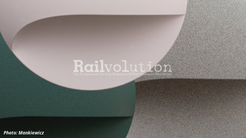
La Fée-Dragée is French for the Sugar Plum Fairy in the Nutcracker by Tchaikovsky. The color shade is similar to the fairy’s pink ballet tutu. The color acts mild, soft and in certain contexts is rather escapist. We associate it with flower petals, soap bubbles and the sky at dawn. In surface design, this color effects a sleek contrast or offset for any surface, interior or product. Not being overly sweet, context and design language can also bring out its serious side, so that it also functions as a ritzy, fresh team player.
Mushrooms remind us of the earthiness of the forest, at the same time they are a mysterious form of life that follows its own rules. “Oyster Mushroom” is a neutral, slightly grayish shade of brown that is found in the shells of snails, tree bark and animal furs. Undyed wool and rough textiles were the inspiration. With their slightly irregular hue and surface, created by the multicolor effect, they exude softness and closeness to nature, yet retain a subtle elegance. As a neutral color it is suited in many contexts.
Green is a hue immediately associated with nature, growth and health. Equally “Under Leaves” immerses us in a colorful oasis of escape: When surrounded by plant life and with only diffused light falling through the foliage, the light can appear slightly bluish. In addition to a feeling of depth and tranquility, it also inspires enchantment – whether we are above or below water. Green is a shade that currently appears with many nuances in all product contexts. From mild, grayish sage to deep petrol tones. It is a color that needs to be combined wisely, but then it shows its strength of character.